
Spring 2025 is bringing a fresh wave of colors that redefine home interiors with vibrancy, elegance, and harmony. The season’s palette is inspired by nature, wellness, and sustainability, balancing soft, earthy tones with bold, refreshing hues. Whether you’re planning a full home makeover or just looking to refresh your space, incorporating trending colors can instantly elevate the ambiance of your home.
This guide explores 10 trending colors for spring 2025 in home decor, providing insights on how to use each shade effectively. From serene neutrals to striking statement hues, these colors will transform your home into a stylish and inviting retreat.
Key Takeaways
- Spring 2025 color trends focus on natural, soothing tones and vibrant accents.
- Soft pastels, earthy greens, and bold blues are dominating interior designs.
- Incorporating trending colors can refresh your home without a full renovation.
- Combining different textures and lighting enhances the impact of colors.
- Using trendy colors in small accents allows for easy seasonal updates.
1. Tranquil Sage
A soft, muted green inspired by nature, Tranquil Sage brings calmness and a sense of balance to any room. This shade pairs beautifully with neutral tones like beige and warm gray, making it ideal for living rooms, bedrooms, and even kitchens. It complements wood furniture and indoor plants, enhancing a natural aesthetic. Tranquil Sage also works well in spa-like bathrooms and home offices, where its soothing qualities help create a serene environment. When paired with natural textures like linen, rattan, or reclaimed wood, it reinforces a harmonious and organic design, making spaces feel warm, inviting, and effortlessly elegant.
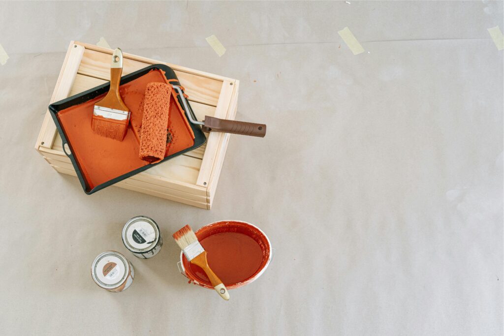
2. Warm Clay
Warm Clay is a rich, earthy terracotta shade that exudes warmth and coziness. This versatile color works well in both modern and rustic interiors, adding depth and character to walls, furniture, or decorative elements. It is particularly effective in living rooms and kitchens, where it creates a grounded, inviting atmosphere. It pairs well with whites, creams, and soft blues for a balanced and sophisticated look, while also complementing natural materials like wood, rattan, and stone. When combined with metallic accents such as copper or brass, Warm Clay brings a touch of understated luxury and timeless appeal to any space.
3. Ocean Blue
A deep, refreshing blue reminiscent of coastal waves, Ocean Blue is a top choice for creating a serene and modern space. It works beautifully in bathrooms, accent walls, and upholstery, evoking a sense of relaxation and tranquility. This color enhances natural lighting and creates an airy feel, making small rooms appear more spacious. It pairs well with crisp whites and soft neutrals for a coastal-inspired ambiance, but can also be combined with deep navy or warm sandy tones for a more sophisticated and layered aesthetic. Adding textured elements like linen or woven fabrics in Ocean Blue can further enhance the room’s depth and dimension.
4. Blush Rose
Blush Rose is a delicate pink hue that adds a soft, romantic touch to any space. It works well in bedrooms, nurseries, and living areas, complementing neutral or metallic accents. This color is perfect for those who want a subtle, feminine touch without overpowering the space. Blush Rose pairs beautifully with warm whites, champagne tones, and muted gold accents, creating an elegant and timeless aesthetic. It also works well with natural textures like linen and wool, adding a cozy and inviting feel. Whether used on walls, upholstery, or decorative accessories, Blush Rose brings warmth and sophistication to any home interior.
5. Golden Hour
Golden Hour, a warm and radiant yellow-orange, brings energy and positivity into a room. Ideal for kitchens, dining areas, and entryways, this shade adds vibrancy without being too overpowering. Its ability to reflect natural light makes spaces feel brighter and more inviting. Golden Hour pairs beautifully with deep greens and warm neutrals for a balanced aesthetic, while also working well with natural wood tones and brass fixtures for a touch of vintage charm. It is particularly effective in creating welcoming environments, making it a great choice for social spaces where warmth and comfort are key elements of the design.

6. Serene Lavender
Serene Lavender is a gentle and sophisticated purple that promotes relaxation and creativity. This color is ideal for bedrooms, reading nooks, and meditation spaces, as it fosters a sense of calm and mental clarity. It works beautifully in spa-like bathrooms, adding a touch of tranquility and elegance. When combined with light grays, whites, and soft blues, it creates a peaceful and airy environment. Serene Lavender also pairs well with natural wood tones and soft metallic accents like silver and brushed gold, making it a versatile choice for both modern and traditional home decor styles.
7. Charcoal Gray
A timeless and elegant shade, Charcoal Gray adds depth and sophistication to interiors. It works well in contemporary and minimalist designs, serving as a versatile backdrop for vibrant accents. This color is perfect for accent walls, cabinetry, and modern furnishings. Charcoal Gray also enhances industrial-style interiors when paired with raw materials like exposed brick, concrete, or metal finishes. It creates a striking contrast with bright colors like mustard yellow or deep blue, making it an excellent choice for those looking to add bold yet refined touches to their home. Additionally, Charcoal Gray works well with layered lighting to highlight its depth and create a cozy, sophisticated atmosphere.
8. Soft Apricot
Soft Apricot is a fresh, uplifting peachy hue that adds warmth and cheerfulness. This shade is perfect for accent pieces, throw pillows, and artwork, creating a cozy yet stylish ambiance. It pairs well with light woods, whites, and warm metallic finishes. Soft Apricot also works beautifully in nurseries and dining spaces, where its gentle glow enhances a welcoming and harmonious atmosphere. When combined with natural textiles such as linen or cotton, it exudes a soft, organic feel, making interiors feel fresh and inviting. Additionally, it complements Mediterranean and bohemian decor styles, bringing a sun-kissed radiance to any space.
9. Verdant Green
Verdant Green, a deep forest-inspired shade, reflects nature’s beauty and adds richness to interiors. It works exceptionally well in kitchens, home offices, and statement walls, providing a sense of grounding and freshness. This color is particularly effective when used with organic textures such as linen, wool, or reclaimed wood, enhancing its natural appeal. In modern spaces, it pairs well with minimalist furniture and sleek metallic details, creating a refined yet earthy aesthetic. Pair it with gold or brass accents for an elegant touch, or combine it with warm neutrals and muted terracotta tones for a cozy and sophisticated ambiance.
10. Midnight Teal
Midnight Teal is a bold and moody blue-green shade that brings drama and sophistication. This color is perfect for accent walls, furniture, and textiles, making a statement while maintaining a refined aesthetic. It pairs beautifully with light neutrals, mustard tones, and deep wood finishes. Midnight Teal works particularly well in living rooms and bedrooms where a touch of depth and elegance is desired. When combined with soft lighting and velvet or silk fabrics, it enhances a sense of luxury and coziness. For a modern and eclectic look, it can be paired with geometric patterns or metallic gold and brass accents, creating a dynamic and visually captivating space.
Frequently Asked Questions
1. How can I incorporate trending colors without repainting my walls?
You can use trending colors in home decor through throw pillows, curtains, rugs, and artwork. Adding colored vases, decorative bowls, or accent furniture like stools and side tables can also infuse fresh hues into your space. Consider swapping out bedding, lampshades, or even small kitchen appliances in trending shades for a more cohesive update. Wall art featuring seasonal tones and textured fabrics like velvet or woven materials in these colors can further enhance depth and dimension. Swapping out accessories and textiles is an easy and affordable way to refresh your space without committing to permanent changes while keeping your home in sync with the latest trends.
2. Which trending color is best for small spaces?
Soft, light shades like Blush Rose, Tranquil Sage, and Serene Lavender work best in small spaces as they create an open and airy feel. Pairing them with mirrors and natural light enhances their effect, making rooms appear larger and more inviting. Additionally, using these hues in a monochromatic color scheme can create a seamless, spacious look. Incorporating furniture with light wood finishes and sheer curtains allows these colors to stand out without overwhelming the space. Strategically placing accent lighting can further enhance their depth, creating a serene and visually appealing environment.
3. Can I mix multiple trending colors in one room?
Yes! The key is balance. Use a dominant color for walls or large furniture pieces, then introduce complementary colors in accents like cushions, vases, and artwork. Layering textures such as velvet, woven fabrics, or ceramic accessories can add dimension while maintaining harmony. Neutrals can help tie the look together without overwhelming the space, allowing the bold and muted tones to coexist seamlessly. Experiment with color distribution by incorporating statement rugs or color-blocking techniques on select walls to create a well-balanced and visually appealing design.
4. Are these colors suitable for exterior home design?
Absolutely. Shades like Charcoal Gray, Verdant Green, and Warm Clay are excellent for exterior walls, doors, and trims, adding character and modern appeal to a home’s facade. Charcoal Gray provides a sophisticated, timeless look that pairs well with metal and wood elements, while Verdant Green blends seamlessly with lush landscaping, creating a natural and welcoming aesthetic. Warm Clay, with its earthy undertones, enhances Mediterranean, rustic, and southwestern-style homes, offering warmth and vibrancy. These colors not only improve curb appeal but also provide long-lasting visual impact, especially when paired with complementary outdoor elements like stone pathways, wooden accents, or bold front doors.
Conclusion
Spring 2025 is all about embracing nature-inspired, warm, and sophisticated colors that bring harmony and freshness into home interiors. Whether through a bold statement wall or subtle accent pieces, these trending colors will transform your home into a contemporary and inviting sanctuary. By thoughtfully incorporating these hues, homeowners can keep their spaces stylish, refreshed, and in tune with the latest design trends.
2 Responses